Mobile app to help people make and manage their barbershop appointments
Background
Everything started right when the client approached us with an intriguing request.
He presented us with the notion that plenty of barbershops are having issues with managing their appointments and just general day-to-day activities.
On the other hand, customers were getting frustrated by long wait time during appointment calls and just suboptimal appointment practices in general.
We were attributed the task of finding a way to somehow bring together both user and business sided needs, all under the same umbrella.
My role
UX Design, UI Design, User Research, Wireframes, Prototype, User Testing
Design Process
‘Awesome’ was our first thought. Our clients request gave us an initial guiding light.
We all agreed that the best course of action would be to adopt a very user centered approach.
The design thinking process looked like our best option going forward. It was now time for us to lay out the which would guide us through the entire process.

Empathy & user interviews
Stemming from our desire to develop empathy for the people that would user our app, we gravitated towards a more qualitative type of user research.
Naturally, user interviews was our research method of choice.
Another important factor in our research was adopting a beginner’s mindset. We had to do our best to leave out our own assumptions and experiences behind when making observations.
Interviewing my friends and family proved to be a unique experience for all of us.
My main questions revolved around what would be a good appointment system in their eyes, what is their criteria when picking a certain shop, and if they had any preferences regarding the payment methods.
Every bit of feedback was taken into account and placed onto post-it notes where we managed to group everything based upon the emerging similarities and trends.

Defining the user needs
It was only a small (and seemingly logical) step to arrive at an affinity diagram. Our post-it notes from the Empathize stage made for an even easier transition.
The affinity diagram helped us figure out and identify the main ideas and needs of our interviewees.
We had reached a point where we felt confident with generating several ‘Point of View’ problem statements, along with a matching number of ‘How Might We’ questions.


Ideating solutions
As a team of 4 very young and eager to learn designers, we ere very excited to start ideating solutions for our previously determined statements
At this point we were looking to generate a greater quantity of ideas, in as short of a matter of time as possible.
The brainstorming session that followed was a big success. Everyone came up with rough sketches to showcase their unique solutions for every HMW question that we had. Every single sketch was accompanied by a task flow.
The end of the brainstorming sessions meant that all of our creations had to be bunched together and voted upon by using a dot voting system. The most appropriate (in our collective assumption) solutions were thus selected.
Another important factor that cannot go unmentioned was that all of us did their own competitive analysis. Personally, I was very curious to see how other similar apps went about solving similar issues as ours.

Interactive prototype
Dot voting results were clear and it was now time for everyone to move on to the next step.
I wanted expand on the sketches and come up with low-fidelity wireframes in order to provide better clarity on the components and content of the app. Expanding even further and creating a prototype would serve me in testing validating my ideas and assumptions.
The needs of the users were always in the back of my mind, guiding every step. A user flow aided in highlighting the logic that followed through every interaction, screen, or action that someone had to take in order to achieve a certain goal.

Test
We continued testing our wireframes against key tasks with our Userberry prototype.
This helped us identify some of the final user frustrations that we need to address so that we could improve our design.
Based on the feedback that we received we went back adjusted accordingly.

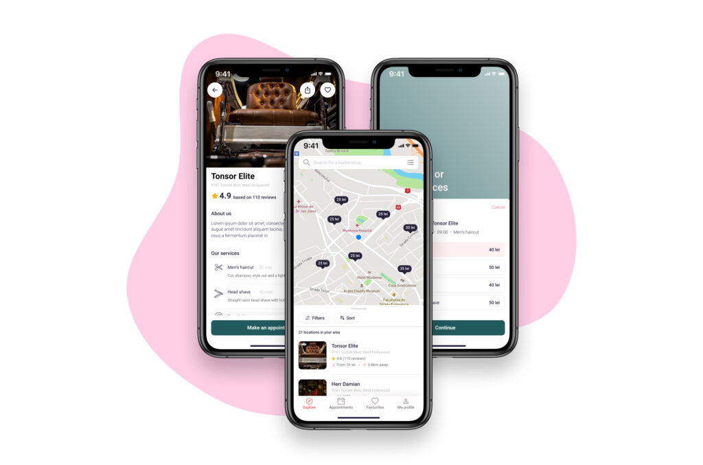
High fidelity design
My main focus was to create a consistent and smooth user interface. I wanted to come up with a visual indentity defined by keeping everything clean and focused on the actual content.
Minimizing people’s effort while using the app by keeping it simple and letting them enjoy the actual activity was one of my goals.

Reflections and impact
As far as the impacts of our project go, the results speak for themselves.
A significant portion of barbershops reported a considerable increase in revenue. Some of them went as high as 80% revenue increase when compared to previous months.
Customer satisfaction went through the roof. People no longer had to experience dropped or unanswered calls. Our appointment system was doing its job. Not to mention the reviews system, which was also playing an important role in reassuring future customers.
Online payment options proved to be very successful. It represented more than 60% of the preffered payment method for our app users. Furthermore, in an increasingly contactless world, implementing a tipping feature was hugely appreciated.
On a personal level, one of the essential lessons that i have learned as a newbee designer was just how vital the concept of testing your solutions really is.
Even though i was a bit anxious about it at first, testing my ideas with various people turned out to be very powerful and a fantastic learning process.